


A logo seems like a task that can be completed in a few minutes, right?
After all, all you need are a couple of shapes and sizes, an attractive, eye-catching color scheme, and maybe a clever motto to wrap all of it up.
Let us tell you straight from the get-go that it’s significantly more complicated than that.
Although your company logo may be a small symbol, it’s definitely an important one. A great logo creates brand awareness and sticks in the minds of your clients. Our brains can instantly recognize a company by its logo and even make assumptions about the nature of the organization. But in order to achieve that effect, your logo needs to incorporate some key design elements.
This is why so many companies are willing to pay a premium sum for professional designers to develop these small graphics. Many people ask themselves, “How come they’re so well paid when their job takes a couple of minutes?” You already know that answer to that - they’re paid for the years it took them to learn how to do that within a matter of minutes.
However, this is not always a necessary sacrifice, so if you can’t afford a renowned designer, then don’t despair. If you want to take on the task of designing a logo yourself, then make sure to follow the tips below on how to make a company logo.
Tips on Choosing the Right Software or Platform
You can choose from several different platforms to design a logo. If you’re familiar with Adobe Photoshop or Illustrator, then you may know that these are great artistic tools. There are many free tutorials on websites such as YouTube, which will allow you to learn the software pretty quickly and be able to create a logo yourself. Although this might take some time, it is definitely time that is well-invested.
The software suggested above is considered industry standard and is used by most graphic designers, whether for a specific purpose or as a general tool. Having access to both Photoshop and Illustrator would be tremendously beneficial, as they are highly customizable and professional tools to embark on the design process with.
However, you might not be willing to invest in expensive software at the moment or pay a subscription price for an online account. There are free design tools out there as well, which can often be even more helpful than professional software - at least in some regard. Our recommendation, however, would still be to opt for what’s been true and tested. Quality has a price to its creation, more often than not.
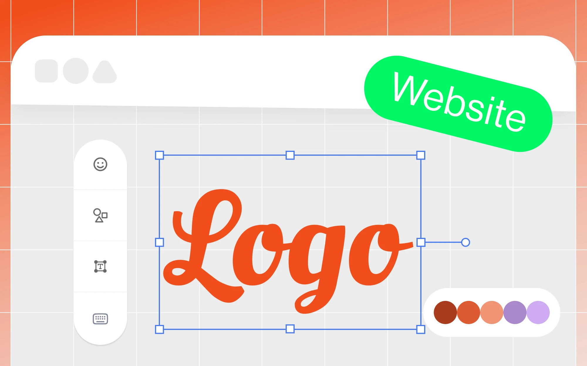
If you don't feel like spending endless hours on designing the logo for your business, try out our free logo maker that lets you choose, customize, and download a unique emblem for your business in just a few minutes.
Tips on Incorporating the Company Name
Many logos have the company name, or some aspect of it worked into the logo. Nonetheless, this is not mandatory; the Target store logo, for example, is recognizable with or without the name “Target” printed below the symbol. The logo for the New York Yankees is simply the initials “NY” worked in using creative font, overlaying each other in a shape that even non-fans recognize immediately.
If your company is widely known or has multiple franchise locations, consider making your company’s name iconic by simplifying the name into an abbreviated or acronymic logo. This can be done even without fame as long as it is intuitive and can be easily etched into the minds of your target audience. Take, for example, the McDonald’s logo, which is quite clearly a stylized “M” letter - it would have been easily memorable even if they wouldn’t have been a fast-food titan.
However, you may also choose to include the full brand name in your logo, as the Natural History Museum decided to do:
![]()
If you want to incorporate the full name of your organization, you need to consider placement. Make sure everything is laid out well in terms of aesthetics and balance. As you can see above, the Natural History Museum is spelled vertically, avoiding a logo that is too wide. On the other hand, if your brand name is short, you should have no problem placing it underneath the graphic portion.
Tips on Choosing the Right Colors
Choose colors carefully and give yourself time to experiment. You want to achieve the best combination of colors and hues and convey a specific feeling or message about your organization. This is where it might help to have some kind of artistic background or at least an understanding of the psychological effects behind the color wheel.
What feelings do colors like red and yellow evoke? Together, do they make you think of a big, friendly yellow “M” against a red background? The colors in the McDonald's logo mimic the colors of the restaurant chain, conveying a sense of joy and family-friendliness.
On the other hand, if you are creating a logo for, let’s say, a financial agency, it would be better to opt for more cool, calm, composed, and calculated tones, such as blue or green, or a mix of the two if you’re feeling eclectic. It all depends on the company’s essence, which you want to convey to viewers and prospective customers.
For comparison, let’s consider the logos of two different companies: Instagram and LinkedIn.

Although Instagram may be used for business, the primary focus is still entertainment and content sharing, which is why the colors are bright and fun. There is a large aesthetic element to the Instagram logo, which cannot be said for LinkedIn. Since LinkedIn is a business and employment-oriented service, the logo is significantly more minimal and strict, using one cool tone instead of a brightly colored gradient.
Likewise, they have incorporated part of the brand name into the logo, as mentioned above. Both are easily recognizable but produce a very different effect. When you look at the Instagram logo, you think “fun,” and when you look at the LinkedIn logo, you think “business.”
Creating a couple of color palettes for your logo and testing out some color combinations is necessary. For example, you can choose to experiment with blues, greys, and blacks for a company that provides consultation services or reds, yellows, and whites if it’s an entertainment-related business.
The key thing here is to compose color palettes that best suit the nature of your business. Check out this article for a more in-depth analysis of logo colors. One of our key suggestions, if you are directly involved in the creation process, would be to enjoy yourself and use your emotions for creative inspiration: nothing works better than a logo that has soul.
Tips on Choosing the Right Font
The font of your logo and your company name on the logo can make all the difference. Simple, readable fonts are usually best since they are quickly processed by the brain. If you are just starting out and want to build recognition for your business, we would recommend opting for a more basic font that is easy to read and really gets your company name out there.
However, if the nature of your business is more unique or eccentric, you can choose to experiment with “handwritten” or cursive fonts. The logo for Disney, for example, was based on Walt Disney’s signature.
Nonetheless, Disney is a classic, widely recognized brand, so the cursive font only works in their favor. Make sure you know where your company stands, and pick the font that best suits your type of organization.
Tips on Avoiding Design Clichés
Some people will tell you to avoid clichés; others will swear by them since they only became clichés because they worked in the first place. Be aware of them, and then you can decide if a design cliché is suitable for your logo or not.
For example, a circle with the company logo or initial encased within is a cliché. For some companies, it works, such as with Beats by Dre or Burger King. If you’re tempted to place your company name within a simple circle of color, be careful because it can also be utterly forgettable unless you add a twist that is unique to your company.
Some would argue that including a pun within the logo would be too overdone or old, while others would feel amused or compelled enough to take an interest in the business. An example would be a pastry shop specialized in pizza bites depicting a stylized, half-eaten slice. Get it? Pizza bites?
Nobody knows your business more than you do. If the cliche applies to your business, then why not use it? Conversely, if your brand is more serious, you should opt for a far more sober approach.
If you’re feeling adventurous or pioneering enough, then our suggestion would be to INNOVATE instead!
Tips on Incorporating White Space
When combining shapes, colors, and fonts, also consider using the white space in your logo to your advantage. White space makes the actual design of the logo more interesting and easy on the reader’s eye while also making the design less overwhelming if the color and shape combinations are more complex.
Furthermore, white space can create its own picture. Think of the Pepsi circle with the splice of white through the middle of the red and blue. Or the bite in the Apple logo. That little bit of white space adds personality, originality, and instant recognition. Likewise, you can create subtle symbols in the white space, such as the bird’s head in NBC’s peacock logo. White space is calming to the eye and makes any graphic more visually appealing.
Tips on Symmetry and Proportion
When creating a logo, you can use both symmetry and asymmetry to your advantage. Some would say that the bite in Apple’s logo makes it asymmetrical, right? But then the leaf at the top is also leaning towards the side of the bite, replacing that white space using indirect symmetry.
Be aware of the proportion of shapes within your graphic. Decide if your company fits best with a curvy, circular theme like the Twitter bird, an angular theme like Domino’s Pizza, or a linear theme like Amazon. If done effectively, you can also combine circles with angles, such as in Volkswagen’s iconic logo.
When making the final touches, rely more on your instinct; if something looks “off,” then chances are that it is. Your logo does not need to be symmetrical, as long as you compensate for slight asymmetry in another way. At the end of the day, your logo should be pleasant to the eye, and symmetry is a crucial part of that.
Tips on Simplicity
You can’t go wrong by starting out super simple. Some of the most famous logos are also the most basic, to some degree. The Nike swoosh. The Apple... apple. Coca Cola. Google. Facebook. The Olympic Rings. It never hurts to start with a really simple graphic and then decide if it’s recognizable and original enough without additional components. If not, then go ahead and tweak the design.
On the other hand, don’t make the mistake of trying to start with too much and creating a logo that’s aesthetically pleasing and complex but also overwhelming to the extent that a customer won’t be able to recognize it instantly.
We hope these tips have made you more confident in starting your logo design journey. Why not start by experimenting with Ucraft’s own logo maker and create a free company logo, and get some logo tips from our designers in the process?
Extra Tip: Have AI Design your Logo in Minutes
No design skills? No problem. Use Ucraft’s revolutionary AI logo maker to generate a fully functional logo and brandbook without doing any design work yourself.
Simply enter your brand name, choose some keywords, and set your colors, and you’ll get access to dozens of high quality, versatile, resizable, and fully copyrighted logo versions to choose from.